Four Interglacials


10/11/2019 12:05 - Posted by Tom van Leeuwen
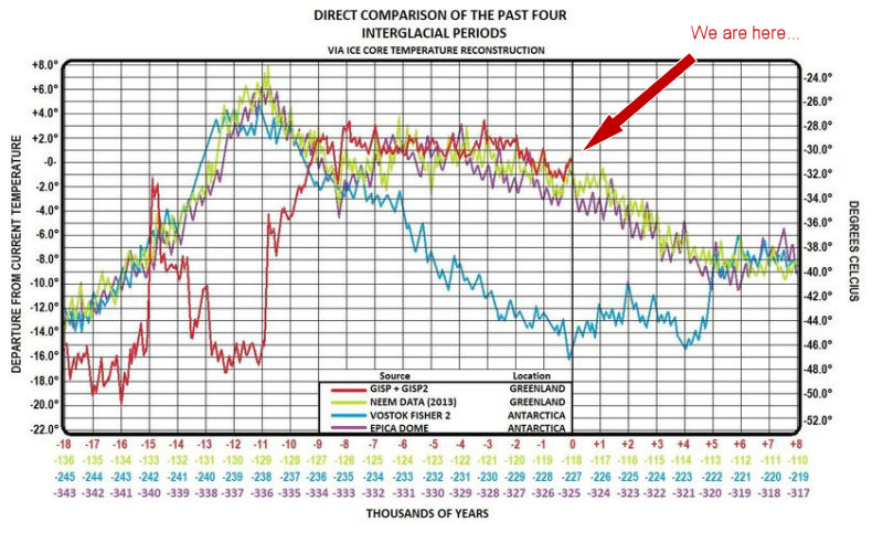
This picture is part of a very interesting paper by independent researcher Brian Catt about the effects of magma and volcanism on the ocean heating through glaciation cycles.
The graph of 4 Interglacial Data Sets was created by James Covington.

It shows the temperature for the last four interglacial periods. Each interglacial has it's own color:

  • Red - The Holocene, from 18,000 years ago until today ("We are here...")
  • Green - The Eemian , from 136,000 years ago until 110,000 years ago
  • Blue - Interglacial "MIS 7", from 245,000 years ago until 219,000 years ago
  • Purple - Interglacial "MIS 9", from 343,000 years ago until 317,000 years ago

The depicted periods are long enough to show not only the interglacials themselves but also their onset and decay into the following glacial periods.

The horizontal axis shows the time range for each interglacial in the corresponding color. The vertical axis shows the absolute temperature at the right-hand side and the difference from the current temperature on the left.

The data is obtained from ice cores from Greenland and Antarctica. The names for each source dataset are mentioned in the graph. These are commonly accepted datasets, used by climate scientists as a proxy for average global temperatures.

Observing this graph, the first thing that catches the eye is the large difference, 28 °C, between the coldest episodes of the glacial periods and the warmest peaks of the interglacials. During these fluctuations, life on Earth adapted to the ever-changing climate, improving after every throwback and finally producing our modern society.
Taking this into account, it's clear that the forecasts made by some scientists, bureaucrats, politicians, the mainstream mass media, 16-year olds, your government and the global government about an apocalyptic warming of 2 °C, tipping points, and a runaway -irreversible- warming into Venus-like conditions are a huge exaggeration.

Our current "Global Warming" is the small uptick marked with the "We are here..." arrow. The natural transition from the Little Ice Age into the Current Warm Period is clearly visible. When you take a closer look, all four graphs sport this ongoing zig-zag movement, with three or four peaks every thousand years. The current peak is no different than the rest of the all-natural, zig-zag peaks over the past 300 thousand years. There are lots of sudden, all-natural, warming and cooling periods much more extreme than the current one.

There is nothing "strange" with the current warming; nothing abnormal. The same pattern has been repeating itself over and over again, for natural causes, every 200 to 250 years.

One last observation. The interglacials Eemian and MIS 9 show almost the same temperature progression. The Holocene had a strange start, the so-called Younger Dryas, but started to follow the other two after that period.
MIS 7 starts with exactly the same progression as Eemian and MIS 9, but shows a strange cooling period, possibly due to four violent volcanic eruptions 233,000 to 230,000 years ago: first the Emmons Lake Caldera in today's Alaska, followed by the Reporoa Caldera, Maroa Caldera and Rotorua Caldera on what's now called New-Zealands Northern Island. After that, it's temperature progression catches up with Eemian and MIS 9.
If the Holocene follows the progression of the previous three interglacials, the Earth is due for a gradual cooling of 7 to 9 °C over the next 5 thousand years. The CO2 emitted by human activity might keep the CO2 greenhouse effect saturated for some time, mitigating the process and prolonging the benevolent climate of the Holocene that played a fundamental role in human development.

Tom van Leeuwen, October 11th, 2019.


Please donate

Fighting the climate hysteria is time-consuming! If you think I'm on the right track and you want to support my efforts I would be more than happy to receive a small donation that will help me to maintain this site.

Thanks!


The fingerprints of the greenhouse effect

The hypothesis of "man-made climate change" tells us that the increase in the concentration of CO2 enhances the greenhouse effect of the atmosphere and has global warming as a final result.

Since the beginning of the industrialized era around 1850, man emits relatively large amounts of CO2 into the atmosphere through the use of fossil fuels. The consequence of these emissions is that during that period, the concentration of CO2 in the atmosphere increased sharply from about 300 parts per million to more than 400 ppm, an increase of almost 40%. The average temperature increased in the same period more or less 1.5 °C with a small variation depending on the data source used.
Read more...

Why did the warming stop?

The political reports of the IPCC are based on the hypothesis that CO2 is the most important control knob of the Earth's temperature. The problem is that this hypothesis does not correspond at all with the empirical data available to science. Forecasts are made using models that are not capable of 'predicting' the past.
Read more...

Temperature versus CO2 – the big picture

When discussing “Climate Change” it’s good to have an understanding of how the Earth’s climate has changed in the past. That will give us a reference to decide whether the current changes are normal or not.

Global temperatures have varied a lot over the last 500 million years. Depending on the timescale used, the current temperature is either cold or hot, so when you want to know the “normal temperature” you’ll have to indicate what timescale you’re using.
Read more...

Dutch Warming

In the Netherlands, the day-to-day whether depends heavily on the direction the wind is coming from. Being a small country, the wind direction is quite homogeneous for the whole country, specially on higher altitudes where the bulk of heat convection is taking place.

Due to its geographical position, midway between the icy-cold Arctic to the north, the dry and hot Sahara to the south, the Eurasian land-mass to the east and the Atlantic Ocean to the west, every wind direction comes with unique weather characteristics.

North - cold,
East - dry,
South - warm,
West - wet whether.
Read more...

Satellite temperature observations

This month of January 2023, the average satellite temperature published, by Dr. Christy and Dr. Spencer (University Alabama Huntsfield) had a negative deviation, compared with the average monthly measures between 1991 and 2000.

Of course, this value does not mean much, it's definition is full of arbitrary begin and endpoints, but anyway it doesn't sound like a lot of warming has taken place over the past 30 years, and even less "catastrophic warming" we're reading about in the Mainstream Media, newspapers and TV stations.
Read more...

CO2 saturation

This graph is all you need to understand that CO2 is not the Earth's Climate Control Knob.

On the horizontal axis, we see the Infra-red (IR) spectrum wavelengths, that is like "IR colors" were this kind of radiation visible to the human eye.
The vertical axis shows to energy flux, that is the energy emitted by the Earth, as seen from outer space.

The graph itself shows how the Earth's atmosphere filters the IR radiation emitted by the Earth's surface and the role of the various greenhouse gases in that filtering process. The green line is the filter of the Earth's atmosphere without any greenhouse gases.
Read more...

Video - Who are the real climate deniers?

The climate has shown many fluctuations during the Holocene. The difference between the highest and lowest average temperature of the past 10 thousand years is about 3 °C.

Climate alarmists, led by the IPCC, are trying to deny this, and understandably so. This variation means that without human influence there was climate change as well.

This undermines their hypotheses and often their jobs depend on it.

Climate change seen from a historical perspective.
Read more...

Satellite Earth temperature February 2022

The satellite temperature departure measurement for February 2022 is exactly 0° C.

This means that Earth temperature during February 2022 was exactly the same as the average from 1991 to 2020.

Satellites are the best way to have insight into the short-term temperature variations. They measure the whole surface, independent of weather station distribution, Heat Islands, measurement failures, surface condition (land or water).

There is a step-wise increase in temperature, triggered by two very strong El Niño events (1998 and 2016.) The energy that welled up from the deep oceans established a new level in these two ocasions, where the warming paused. This is a natural phenomenon and has nothing to do with CO2, or human activity.

Where is the Climate Emergency? It just does not exist.

Wake up and spread this information to your government!

Tom van Leeuwen, March 1st, 2022.